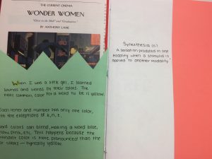
Synesthesia and the Sea Symphony
I’m a synesthete, which is a really fancy name for someone who sees colors other than the font they’re printed in when they read. While these words read black and white to everyone else, I see bright yellows, oranges, greens, and blues. Essentially, my experience reading is like a trippy rendition of a Lisa Frank folder.

Throwback to the 90’s
Though the colors that I experience when I read aren’t the same as how Lisa Frank colors hers, the blending on her words and in my head are really similar.
As in, letters can bleed into one another, creating a really pretty blend.
Lisa Frank doesn’t model her work after synesthesia, its an aesthetic. However, its the closest pop culture example that I can share with people when I want to relate how my synesthesia affects my reading. I’ve always wanted to express what I see, but I haven’t had the opportunity to do so until this project, and it gave me an avenue to get creative with it. Right now, my favorite symphony is R. Vaughan Williams’ A Sea Symphony. It combines two things that I love: classical music and the ocean. It also looks really pretty with my synesthesia. Therefore, I decided that for my book I would transcribe Movement II: On The Beach At Night Alone, my favorite movement in the poem, in the colors that I see.
Prototype I
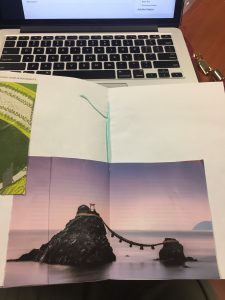 My planning stage was mostly me designing the book and using colored paper and magazine cutouts to tell a story. I was only considering A Sea Symphony at this point, so I layered my cut outs to be versatile. I picked images that I could use to help tell this story, but I wanted to be able to change my mind. My main goal was to just create the foundation to tell my story on, and I feel as if I accomplished that. My biggest obstacle was actually cutting everything out. My right hand is only good for grabbing things, so using scissors was a struggle.
Prototype II
 This was the prototype where I planned out exactly where I was going to place my words. My goal was to write my introduction and define synesthesia before subjecting my readers to a myriad of colors without explanation. I also incorporated the lyrics in black, to make it easier for people to read. I accomplished placing all of the words in black font, but I did struggle with spacing the first few lyrics. Once I got the hang of it, I didn’t run into any more trouble.
Prototype III
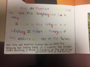
This is the prototype w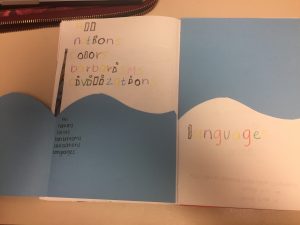 here I added in all of the colors. This was definitely the most fun for me, because it looks so right, compared to staring at black font all the time. This wasn’t difficult for me to do, but it was tedious to open and close different markers repeatedly. Halfway through the process I switched to crayons, which sped up my working time, but changed how the letters looked. My biggest limitation with this stage was incorporating the color yellow. Yellow is one of the most popular colors that I see while reading, but yellow markers and crayons fail to show up as brilliantly. Ultimately, I’m really happy with how it turned out!
The Final Product
Once I finished creating the book and filling it in, I went and added the other, extra aspects that our class decided to incorporate in every book. The book certainly isn’t perfect, but with the materials and the time I had to create it, I can’t complain with how it turned out. Something that I really enjoyed about this project is that my synesthesia is totally unique to me. Every synesthete has a different color set, and experiences these colors differently. Some people can smell the color blue, others feel shapes or music on different parts of their bodies, but mine is just different coloration on letters and numbers.
My friend, Alexis, is also a synesthete, but her synesthesia isn’t as severe as mine. With hers, only certain letters and numbers have significant colors. When I showed her my final book, she liked it but said that my “G’s are wrong. They’re not orange, they’re green.” G has always been a bright orange letter to me, and I find it funny that to her, they’re a shade of green.
 In fact, Alexis and I disagree on every color for our letters. To the right is a page out of my book that has the most combinations of colors in words, and we spent a good bit of time debating on what we saw each letter as.
This project ended up being a ton of fun, and although I wish I could have used the same types of writing materials throughout the entire book, I’m happy with how this turned out!
Citations
Frank, Lisa. “Lisa Frank Design.” N.p., n.d. Web. <http://az616578.vo.msecnd.net/files/2016/04/10/6359591105248064921547775794_lskfrank.jpghttp://az616578.vo.msecnd.net/files/2016/04/10/6359591105248064921547775794_lskfrank.jpg>.
Irish, Alexis. “A Conversation about Synesthesia.” Personal interview.