Animals and Their Anatomy-Prototype #3
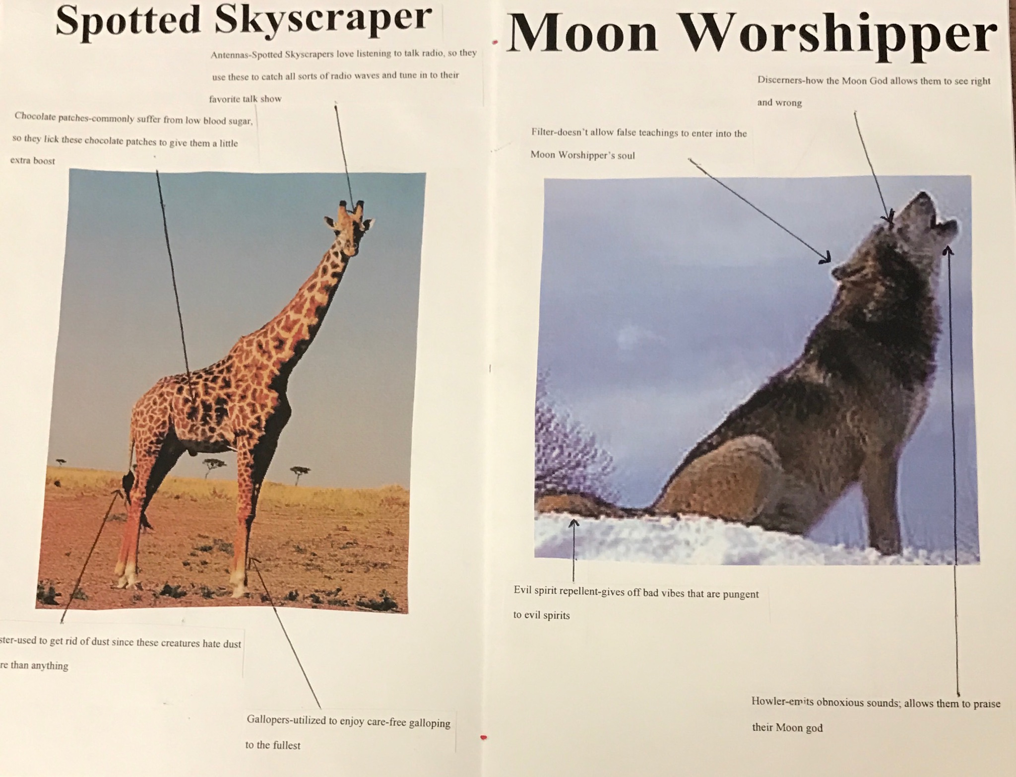
My goals for this prototype was to increase the aesthetic appeal of my book. I was able to add in some arrows that connected the descriptions to the actual anatomical structure it went with in order to give more clarity as far as what went with what. However, I became pretty sick the last couple days and wasn’t able to expound on the actual aesthetic part. Therefore, for my final prototype, I will definitely try to add a lot more aesthetic appeal in order to make up for my lack of progress on it this time around.
In the pictures below, you can see the arrows that I decided to add in order to clear up any confusion the reader might have.
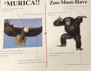
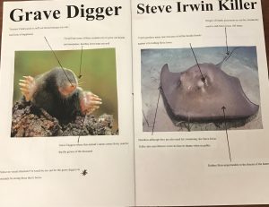

As you can see, the layout of the book is fairly structured, but still needs some work on the aesthetics that can capture the readers’ attention. I am thinking of maybe adding in some fun stickers or playing around with some pop-up stuff for my last prototype, as well as incorporating the some last requirements for the final booklet.
From this process, I learned your plans don’t always pan out like you would want them to and that you have to adjust to your current situation. More importantly, it is ok to accept skewed plans because obviously life doesn’t play by our rules.
I can’t really read the tiny print on the pictures you included because I have bad eyes but the big titles for all of them made me laugh, so I can’t wait to read the final thing! My book didn’t exactly pan out how I wanted it to either, but I think that definitely adds to the fun of this project.
Alex,
The “Steve Irwin Killer” actually made me laugh out loud. I might say that the font is a little small, but that’s really nit-picky and according to Dr. Churchill, I need to find something to criticize you for (lol). Your book looks great, and funny. I’m looking forward to reading the other animal titles that you come up with.
Alex,
I completely agree with you this process teaches you so much about how your initial visions change as you hope to create a polished final product. I also might say that the font may be tiny, but I cannot fully tell if this is due to the pictures or the actual font size. I really enjoy the light hearted feel of the anatomical observance of these animals because you have given them names based on their innate behaviors. I look forward to seeing the final prototype.
Alex-
I love your honesty with your continued progress or lack there of dude to illness. That is awesome. I am also impressed with your images and grows. This book looks high class and professional! Congrats. I would suggest adding borders around the comments to make them pop more, because I mostly just tare at the pictures. I would consider a blue or purple border around them!